Optimising user flow with a 3-day sprint
SaaS dashboard design for efficient implementation
Transform a cluttered dashboard into a clear and intuitive experience. By focusing on key user needs under a tight deadline, I delivered a strategic redesign that ensured both high impact and a cost-efficient implementation.
Company
Actors First LLC
Services
SaaS Product Design Dashboard UI/UX
Industries
Entertainment Technology, Talent Management
Date
2025
With no clear guidance from the client, just a request to 'make it a bit better,' and under the constraint of minimal development costs and time, the goal was to improve the SaaS dashboard. Repunzel is a key platform designed to help actors manage their submissions and connect with talent agents. The primary goal was to help users better understand their submission status and next steps through a more intuitive, user-friendly layout and supportive tone.
Overview
The project involved a rapid redesign of the Repunzel user dashboard, with a critical focus on maintaining visual consistency with the existing design styles of the platform's other pages. Driven by direct client feedback and identified UX concerns specific to SaaS applications, the goal was to reduce visual clutter, simplify information presentation, and provide clearer guidance for users managing their talent submissions. I explored two distinct design approaches to meet these objectives, balancing immediate practicality with a more ambitious, user-centric vision for a modern SaaS interface while ensuring a cohesive user experience across the entire product.
Existing dashboard
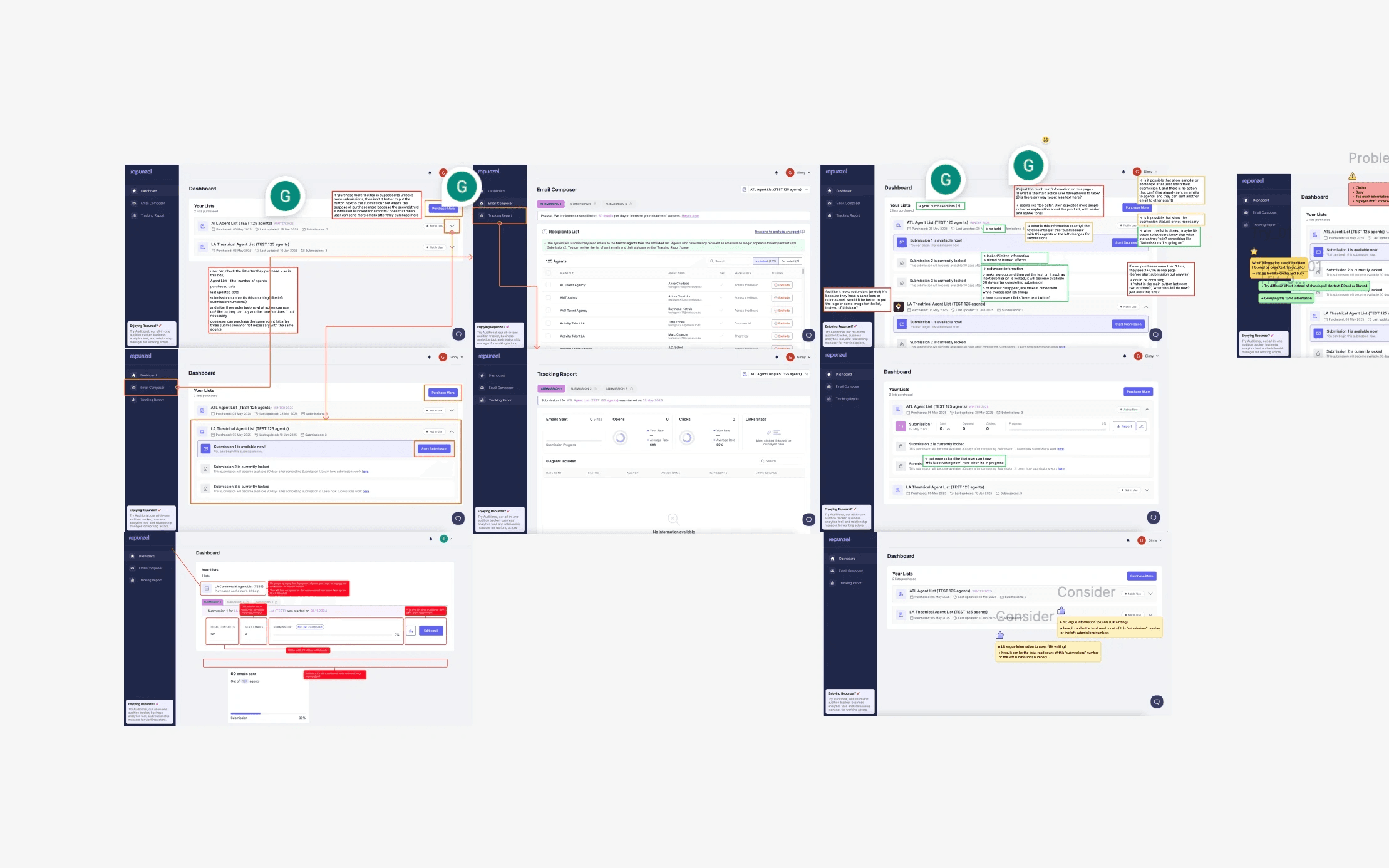
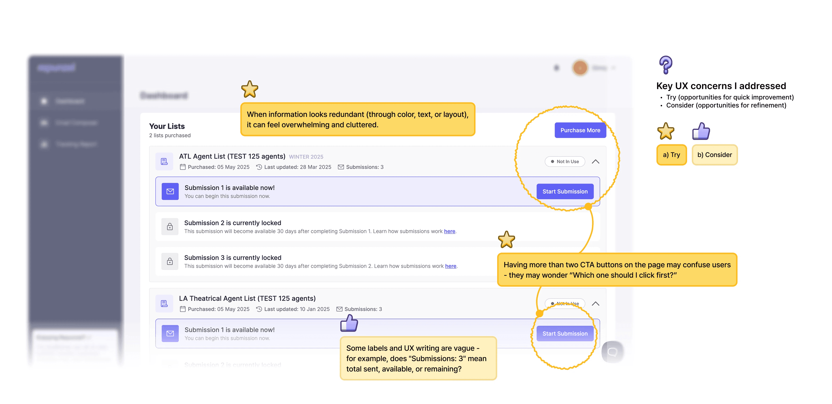
Client feedback highlighted key pain points with the existing dashboard: it felt 'cluttered' and 'busy,' with 'too much information,' and users reported difficulty in discerning key information or identifying clear focal points. Furthermore, a review revealed redundant information, ambiguous UX writing, and an overwhelming number of call-to-action buttons, leading to user confusion about where to focus their attention and what action to take next.
Analyzing the existing user flow: Identifying key pain points and outlining design considerations directly on the product
Key slides from the client presentation, detailing problem identification, design approach, and proposed solutions
Approach
My design process was guided by two core questions: 1. How can we simplify user actions and provide clear guidance? 2. How can we reduce the amount of text to help users focus?
✦
Based on these questions, I developed two main options for the redesign:
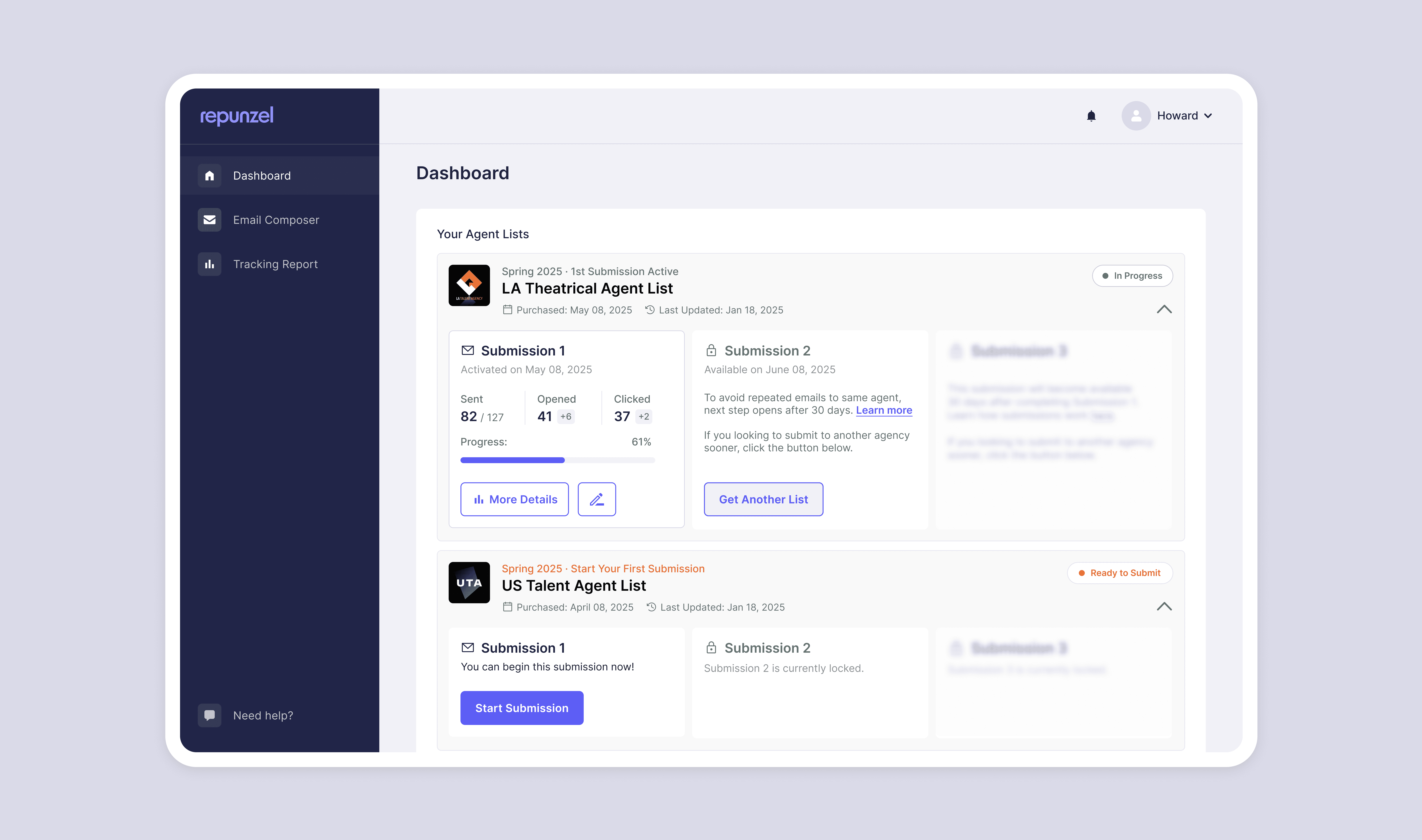
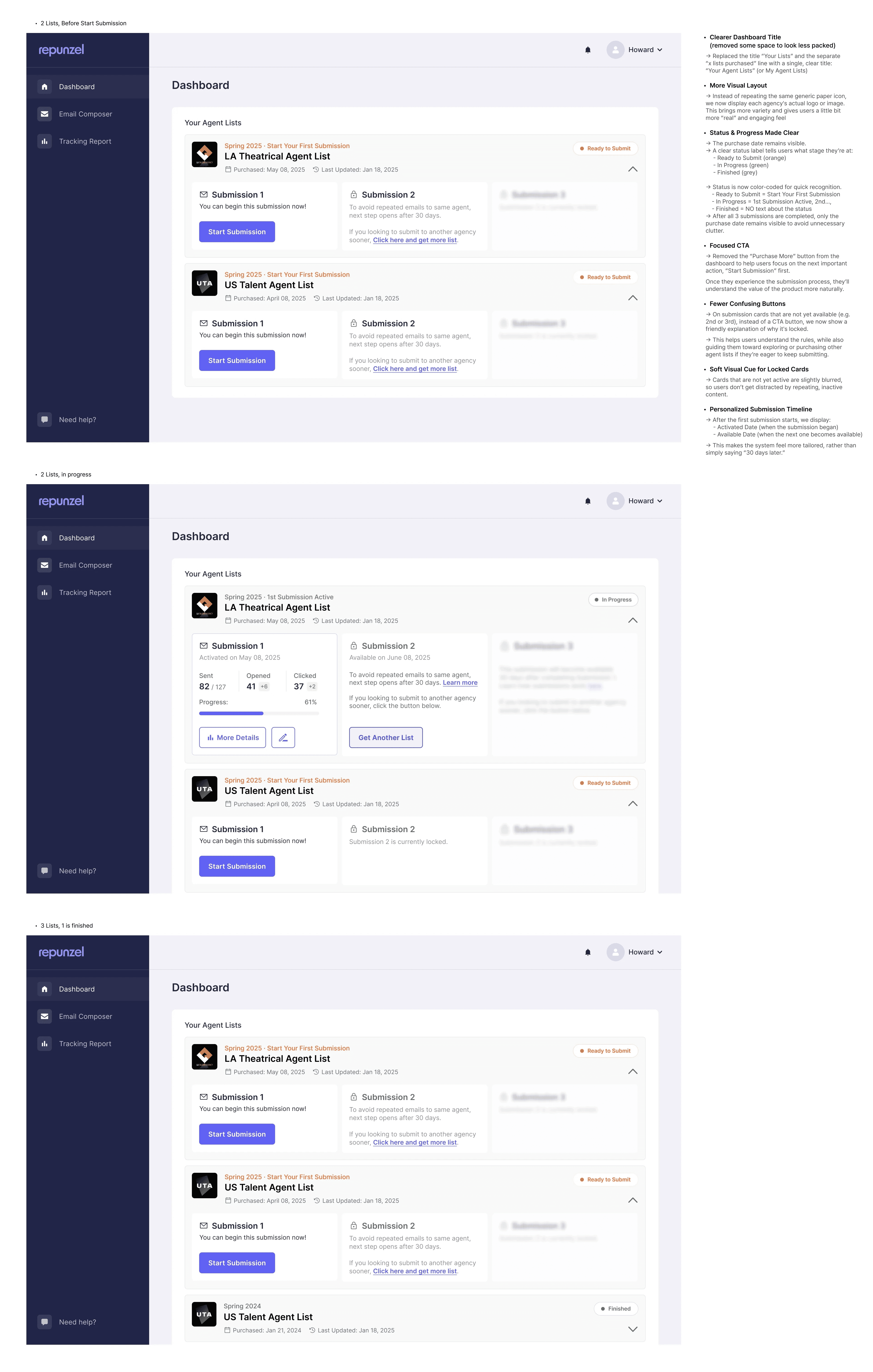
Option A (Practical & Realistic):
Focused on immediate, actionable improvements.
Addressed key UX concerns by streamlining information and clarifying language.
Reduced the number of competing call-to-action buttons for clearer focus.
Prioritised a conventional, developer-friendly design path to ensure seamless integration with existing product pages.
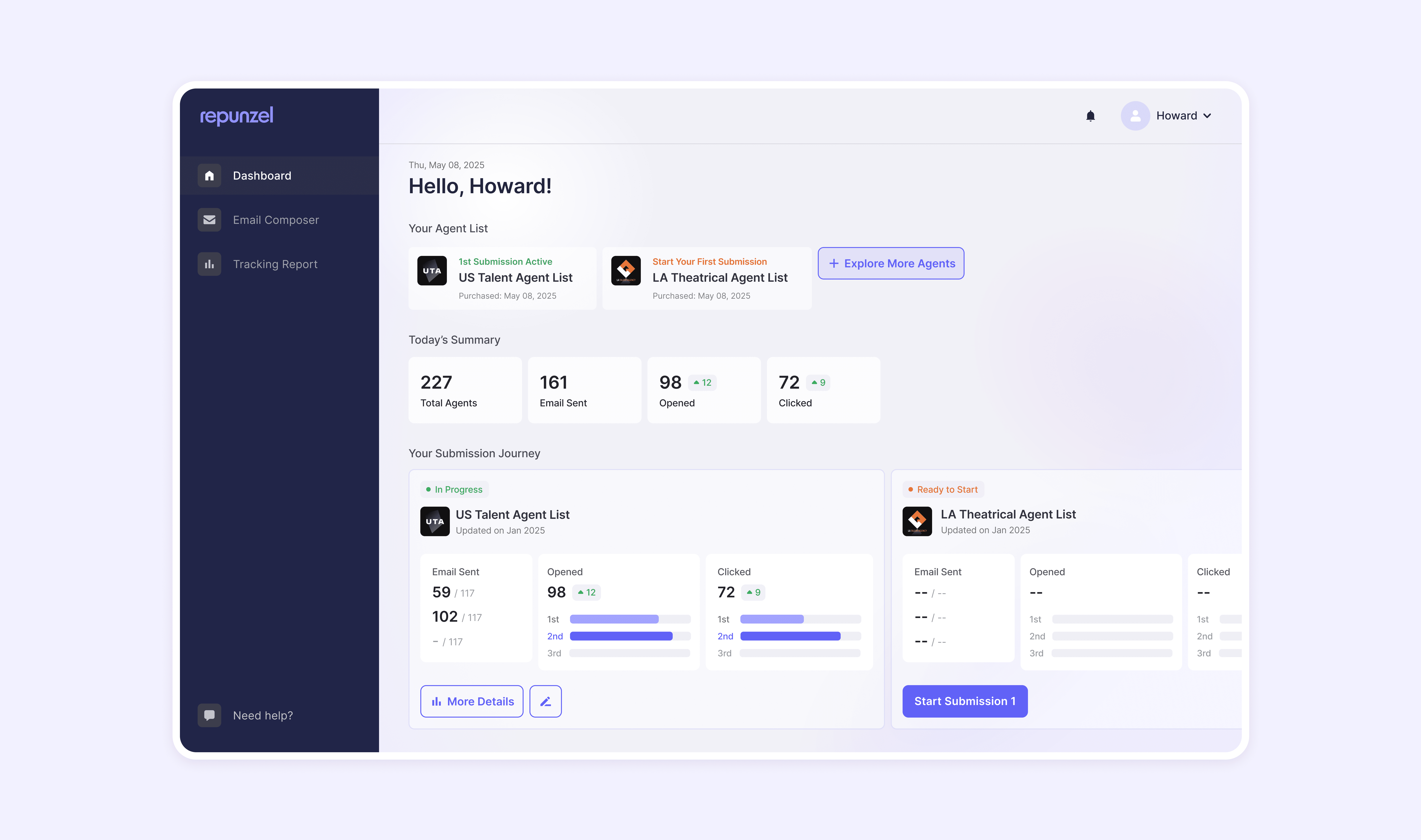
Option B (Personalised Assistant Concept):
Explored a more conceptual direction: transforming the dashboard into a "personalised assistant."
Aimed to create a feeling of gentle guidance, making Repunzel feel like a supportive mentor rather than just a data display.
Focused on anticipating user needs and proactively guiding them through the submission process.
Acknowledged the need to find the right balance for overall product alignment, given its distinct tone and layout.
Presentation slide showcasing the proposed redesign (Option A) with detailed annotations explaining the key changes and improvements


